Case study · African market + kitchen · Denton, Texas
Dafricana
A whole market in one inviting storefront.
A food-led commerce experience that brings the kitchen, bakery and African grocery shelves together with one basket and a pickup path.
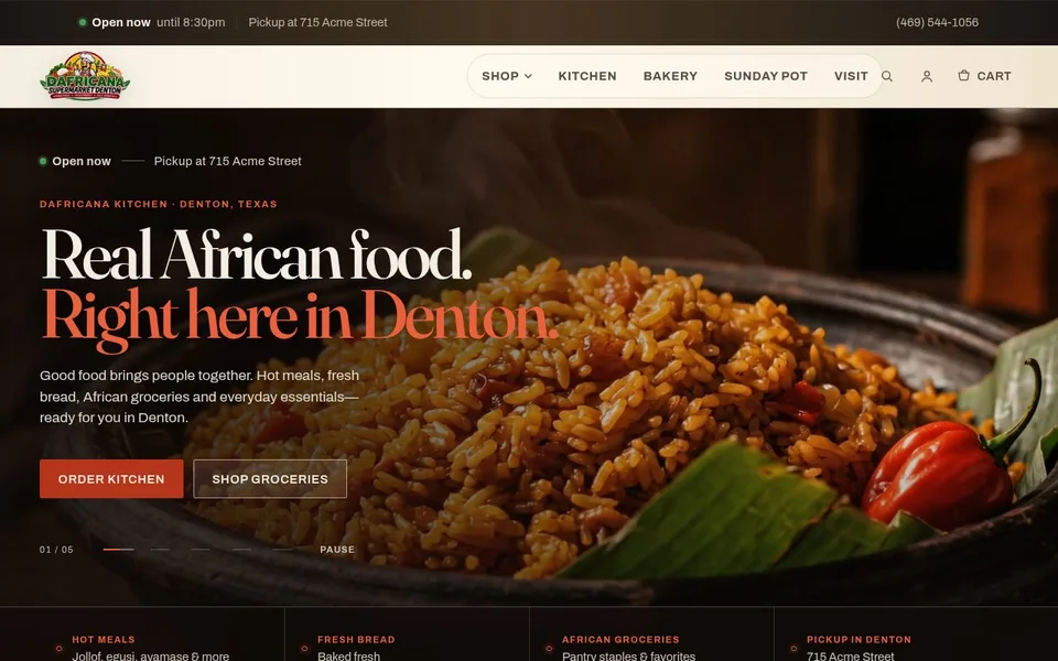
The product is the hero: food, warmth, and a clear way to shop.
Open the project to experience the layout and interactions in the browser.
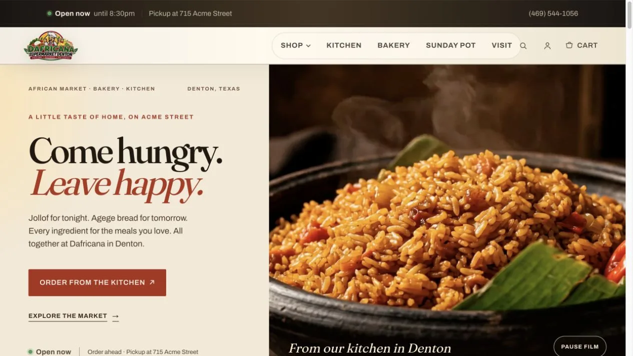
BEYOND THE FIRST SCREEN / 02
The details make the difference.
The challenge
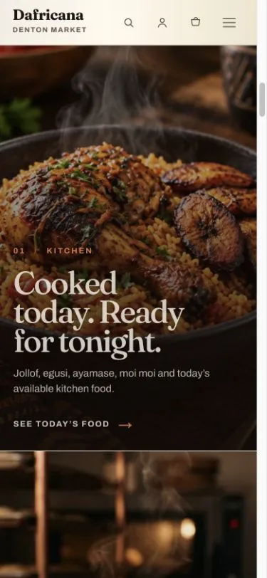
Dafricana offers several reasons to visit: hot meals, baked goods and groceries. The design needed to make those offers feel like one place, while helping a shopper move quickly from craving to category to pickup.
Our approach
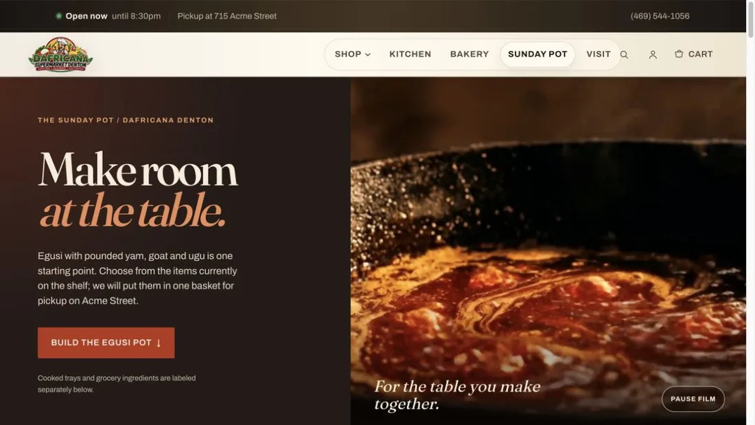
The first screen leads with food and two direct shopping actions. A three-part editorial sequence introduces the kitchen, bakery and market. Product cards put real items in reach, while the Sunday Pot flow turns meal planning into a guided basket. Pickup details are repeated where they matter.
What we built
- Food-led homepage and distinct kitchen, bakery and market routes
- Product discovery with prices and quick-add actions
- Sunday Pot journey that helps shoppers assemble a meal
- Shared cart and secure checkout handoff
- Pickup, opening hours and contact information near buying decisions
Decisions worth explaining
Make the whole offer legible. Kitchen, bakery and market each get a clear entry point, while the visual language keeps them together as one destination.
Use food to create desire. The hero focuses on a dish rather than a generic storefront claim; the shopping controls remain immediately visible.
Keep pickup in view. A customer can see where and how to collect an order before committing to a basket.
What you can verify
The working preview demonstrates the browsing, basket and pickup journey. This case study describes the experience that can be inspected today; it does not claim sales or conversion gains without measured data.
Explore another experience: E&S Lounge. Or see all work.